
Lab Report Template
A lab report tells the story of an experiment: what you asked, what you did, what you found and what it means. This template walks you through each section with prompts for school or university level, builds a results table that calculates the mean and standard deviation of each column, works out percent error against an accepted value, and assembles everything into a neatly formatted report to print or download.
- Free to use
- No sign-up
- Runs in your browser
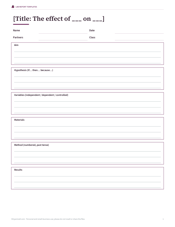
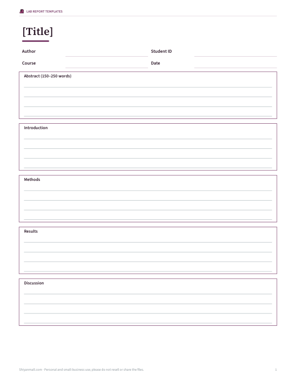
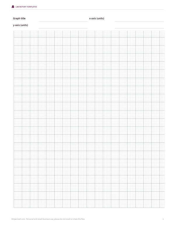
Lab report builder
Results table
Percent error
Lab Report Templates
Editable Word lab report templates for middle school, high school and university, graph paper, a risk assessment form and a marking checklist.
- High school template (DOCX/PDF)
- University template (DOCX/PDF)
- Graph paper (PDF)
- Risk assessment (PDF/DOCX)
- Marking checklist (PDF/DOCX)
Formats: DOCX, PDF. Instant download after payment (link valid 72 hours, up to 5 downloads). AI-assisted: the templates were drafted with AI help and reviewed and laid out before publishing.
$5.00 USD, one-time 5 files · about $1.00 each
- Instant download
- 7-day refund
- Secure checkout by Stripe
7-day money-back guarantee. Full refund within 7 days of purchase, even after you download.
Free sample: Lab Graph Paper (PDF, 55 KB)
Full refund within 7 days — see the refund policy and license.
Free printables
Single sheets you can print right now, no sign-up. The full pack adds every sheet in one download plus the editable files.
 Printable Risk Assessment Sheet
 Printable Lab Report Checklist
The sections of a lab report
| Section | What it answers | Tense |
|---|---|---|
| Title | What was investigated? | — |
| Aim / purpose | Why was the experiment done? | Present |
| Hypothesis | What did you predict, and why? | Future / present |
| Materials | What did you use? | — |
| Method | What exactly did you do? | Past |
| Results | What did you find? (data, tables, graphs) | Past |
| Analysis | How did you process the data? | Past / present |
| Discussion | What does it mean? How reliable is it? | Present |
| Conclusion | What is the answer to the aim? | Present |
| References | Which sources did you use? | — |
University reports often add an abstract at the start — a short summary of the whole report written last.
Writing a good hypothesis
A hypothesis is a testable prediction with a reason: “If the length of a pendulum increases, then its period will increase, because a longer pendulum has a larger arc to travel at a similar speed.” It names the independent variable (what you change), the dependent variable (what you measure) and the expected relationship. The results will support or not support it — scientists avoid saying they “prove” a hypothesis.
Presenting results
- Put the independent variable in the first column and the dependent variable in the next columns.
- Include units in column headings, not in every cell.
- Record raw data to the precision of your instrument, and keep decimal places consistent.
- Repeat trials and calculate the mean; the standard deviation shows how much the repeats vary.
- Plot the independent variable on the x-axis and the dependent variable on the y-axis, with a title and labelled axes.
Worked example: pendulum data
| Length (cm) | Mean of 3 trials (s) | SD (s) |
|---|---|---|
| 20 | 0.900 | 0.010 |
| 40 | 1.270 | 0.010 |
| 60 | 1.550 | 0.010 |
| 80 | 1.800 | 0.010 |
The sample data in the builder give these means and standard deviations. Period increases with length but not in a straight line — doubling the length from 20 to 40 cm increases the period by about 41%, close to the factor of √2 predicted by physics. The percent error example compares an experimental value of g = 9.72 m/s² with the accepted 9.81 m/s²: |9.72 − 9.81| ÷ 9.81 × 100 ≈ 0.92%.
Discussing errors and reliability
| Type | Example | How to reduce it |
|---|---|---|
| Random error | Reaction time when starting and stopping a stopwatch | Repeat trials and average; time several swings and divide |
| Systematic error | A ruler with a worn zero end | Calibrate; check instruments against a standard |
| Human error (avoid this phrase) | “We made mistakes” | Name the specific source instead |
| Resolution | Stopwatch reads to 0.01 s | Use a more precise instrument or data logger |
Using the builder
- Choose your level; the prompts beside each heading change to match.
- Write each section in the boxes — your text is saved in this browser as you type.
- Paste or type your data: one row per line, values separated by commas.
- Enter experimental and accepted values for percent error.
- Print the report or download it as text to paste into a word processor.
Significant figures and precision
Record measurements to the precision of the instrument — a ruler marked in millimetres gives lengths like 12.5 cm, not 12.53 cm — and keep the same number of decimal places down a column. When you calculate a mean, quote it to about one more decimal place than the raw data at most. In the results table, the standard deviation shows how much repeat measurements vary; if it is large compared with the differences between conditions, the pattern may not be reliable.
Graphs in lab reports
| Data | Graph |
|---|---|
| Continuous independent variable (length, temperature) | Scatter graph with line or curve of best fit |
| Categories (type of material, brand) | Bar chart |
| Parts of a whole | Pie chart (rarely used in science) |
| Change over time | Line graph |
Label both axes with the quantity and unit, choose scales that use most of the grid, and draw a smooth line or curve of best fit rather than joining the dots.
Common mistakes
- Writing the method as instructions (“Measure the length”) instead of what was done (“The length was measured”).
- Mixing results and explanations — keep explanations for the discussion.
- Missing units or inconsistent significant figures.
- Concluding more than the data supports.
- Forgetting to reference sources used for theory or accepted values.
Privacy
Your report text is stored only in this browser so you can come back to it. Nothing is uploaded.
Lab report pack
The optional pack includes editable Word lab report templates for middle school, high school and university, a graph paper sheet, a risk assessment form and a marking checklist teachers can share. The builder above is free.
AI-assisted content
This page was drafted with AI assistance and reviewed before publishing. Follow your teacher’s or course’s required format.
Frequently asked questions
What are the parts of a lab report?
Title, aim, hypothesis, materials, method, results, analysis, discussion, conclusion and references.
How do you calculate percent error?
|experimental − accepted| ÷ |accepted| × 100.
Should the method be in past tense?
Yes, usually past tense and often passive voice.
What goes in the discussion?
An explanation of the results, evaluation of errors and suggested improvements.
Does the tool calculate averages?
Yes, the mean and standard deviation of trial columns.
Is my report saved?
Yes, in this browser on this device.
What is the difference between results and discussion?
Results describe what you found; the discussion explains why and evaluates reliability.